Sunday, 26 February 2017

Final Evaluation

I think that my project was quite successful, I explored age in portraiture in a variety of ways, at the beginning of my project I was taking photographs of many different ages, however at the midterm evaluation I decided to hone in on youth portraiture as I decided that it would be better because I was able to experiment with the images more. This is because I am around people my own age more so I was able to take more photographs in the studio at college and when I was out as well.
When selecting my final portfolio, I looked at each shoot individually and selected my favourite photographs from each one, however some of my shoots worked better than others and I also wanted the portfolio to work well together, showing how my photography progressed without looking messy. At the beginning my photographs were a lot more colourful and candid, however as I explored studio work, they became a lot more structured and deadpan. I think that this style worked really well as it allowed me to focus on the lighting and the background etc. 
I think I have created a cohesive body of work, although I think that if I had done a few more shoots then it would've worked better, some of my earlier shoots aren't as good as I think they could've been 


This image is from one of my earlier shoots, and although I like the photograph, I think it is of much lower quality when comparing it to a later shoot. At the beginning of my project, I wanted to take photographs in a variety of places to have interesting backgrounds, although I ended up enjoying doing shoots in the studio, I think they worked well.
This photograph is good, although candid images don't always work well and look like they are too posed. They aren't a reliable style of photography.

This is one of my later shoots, I really like how this worked as I used one light to light up the face and left the background without light, this created the effect that I wanted which was the style of Chuck Close's portraits, I really liked the daguerreotype style as it means that the audience can focus on the features of the subject, as it is in extreme detail, rather than looking at what is going on in the image like in some busier images.


I believe that this is a cohesive body of work because it shows progression, as I got the shoots done you can see a change as I tried out different things like studio work or deadpan portraiture. I really like the later shoots that I did in the studio and I like the gifs that I made in photoshop.

I like this gif because it definitely shows what I wanted, I wanted to look at the difference between the deadpan image and the smiling image as they contrast quite a bit. I think that these two gifs are definitely different, you can tell that I improved from my first gif to my second. Firstly, the second gif has much better lighting, the first gif has a slight vignette. This is because I placed the back lighting incorrectly and it was slightly hitting the subject, whereas in the second gif, I didn't have this problem as I learn't from my mistakes. Furthermore, the first gif is a lot more jolty and it doesn't flow as well, the subject moved too much and I didn't correct it during editing. Although in the second gif, the movement flows a lot better, the subject doesn't move very much at all.


 My work was definitely influenced by my research, I was really inspired by the work of Thomas Ruff and Chuck Close, they both used deadpan in their work, which I really liked exploring in my own work. Both of these photographers worked in the studio, although they did their work very differently, Ruff worked mostly with lighter backgrounds, whereas Close used black backgrounds so that there was a heavy contrast with the white/grey colour of the faces. He focused solely on the subjects face, with a very small area of focus. Whilst Ruff used a large area of focus and the whole subject is in focus.


Originally, I wanted to look into different ages, focusing on portraiture, although as I started the project, I decided that it would be better to focus on youth as there is a larger opportunity for me to take photographs. At the beginning of my project, I took photographs of a variety of ages, although at the end of the project I focused solely on people my age so around 16-18 years old. I really enjoyed this as it gave me more variety in locations, I could easily do studio work, but also I could go out to London with friends and take photographs there. Whereas for me it was slightly more difficult to take photographs of younger children and older people as I don't know that many old people and children can be difficult to photograph.


Thursday, 16 February 2017

Shoot Ten - Contact Sheet


Shoot Four - Contact Sheet


Shoot Three - Contact Sheet


Shoot Two - Contact Sheet


Shoot Two - Work Diary

Aperture: 5.6
Shutter Speed: 1/3200
ISO: 400
This image is probably my favourite from the shoot, I think that it is good because of the composition of the image, the subject is at the left side of the photograph rather than in the centre, this looks good because she is looking over to the side, if she was looking to the other side I think that this photograph would look quite weird. I love how the weather was in this photograph as the whole image is very bright, the lighting makes the subjects face entirely visible, rather than a large shadow being on the face.

Aperture: 4.5
Shutter Speed: 1/3200
ISO: 400
This is the worst photograph from the shoot, there is too much going on in the image, furthermore the subject isn't even facing the camera. There is also another person in the side of the image which doesn't look good, the image just looks cluttered, in addition, there is a shadow on the subject which doesn't look very good, I think that it makes the photograph look badly composed.

Progression:
Next time I would like to think about the composition of my images more, instead of taking photographs of people without preparing for it first, I should've asked people to pose as well as taking candid photographs as these are less dependable, it is less likely to go well if it is a candid photograph.

Shoot One - Contact Sheet


Computer Experiment 4


To create this image, I made a duplicate layer of the background and then copied a different photograph and added it on as another layer called layer 0. 

I changed the opacity of layer 1 to 50% so that you could see layer 0, this meant that both photographs were visible at once, I like this because the backgrounds are the same colour so it works well, it shows the change in emotions and how people, especially teenagers change the way they act when they know there is a camera there. I moved the two images so that they were both showing.

Photographers Research - Don McCullin

This image shows a man in a war, he seems to be very distant and doesn't look aware of the camera, this gives the audience the idea that he is suffering from PTSD, McCullin takes documentary photography so he tells true stories with his photographs, he doesn't edit his images to tell a different story that isn't the truth. The shadows over his eyes make it seem like he isn't able to see properly or isn't able to understand what he is seeing. 
Furthermore, the way he is holding his gun makes it seem like he isn't ready to fight, he is holding the gun barrel so he isn't holding where the trigger is, which makes it seem like he is very reluctant to shoot the gun.

This image is of a homeless person, McCullin has used a very high contrast for this image as it makes it look very striking, the photo looks very wild, his hair is not very tame at all and it is spiked in different directions, however the eyes of the man in this image are very calm and they are staring at the camera, this could show that he doesn't want to be in this position.

This image is of a man about to be shot in the head, this photograph is interesting because we don't know how it turned out. We don't know if he got shot or not. The punctum of this image is definitely the gun as it draws our attention towards what is going on in the photograph, the actual people rather than the background.


This photograph is very interesting, it shows a man in Africa, I love the symmetry of this image with the jewellery, the two earrings are facing different ways and the man is positioned in the centre of the image. The connotations of this image are that we are unaware of his culture and the way he lives and I believe that McCullin did this on purpose by using lighting to block out the mans eyes so we don't know exactly what he looks like, this means that we can't make assumptions about who he is.
The punctum of this image is probably the earrings as they are the brightest thing in the image.

Wednesday, 15 February 2017

Computer Experiment 3

To create this image I had to go onto photoshop and create a duplicate layer from background so that I wasn't editing the original. I then went to filter as you can see below and chose the mosaic pixel filter. However as you can see, the model isn't pixelated, just the background and her phone, I did this by using the quick selection tool and selecting the background and her phone, whilst not selecting her. 
I used curves after the pixel filter because the original photograph is quite light and I wanted the darkness to be a bit lower.


Computer Experiment 2

To create this effect on photoshop, I first made a duplicate layer from the background so that I wasn't editing the original photo and I could easily go back and erase my edits if they didn't work out well.
I then went to filter at the top of the screen and clicked liquify which let me edit the photograph in a few different ways, I chose to use the forward warp tool which is the one selected in the screenshot.


Computer Experiment 1

This image was taken in the studio with a snoot, this creates the effect that one side is darker than the other which is what I wanted.
To create this image I used photoshop
The image started out like this, I then changed the brightness/contrast, turned the image black and white, and edited the curves of the photograph
I edited the brightness so it was a lot lower, and brought the contrast up a lot, then for the black and white filter, I made the reds a lot darker so that the imperfections on her face would stand out a lot more, and so that her hair would be a bit darker. I made the cyans a lot lighter so that her eyes stood out more. Then I used curves to make the photo slightly lighter so that it contrasted a bit more.

Thursday, 9 February 2017

Shoot Six - Work Diary

Aperture: 20
Shutter Speed: 1/125
ISO: 200
This image is probably my favourite from this shoot, the lighting worked really well because the background is dark as well as the clothing so we don't see a sharp difference between the two. I also edited this image because I wanted to show it with a higher contrast like Chuck Close's images. The subjects hair has a bit of light reflecting off of it which I like because it adds an extra bit of texture to the photograph.

Aperture: 20
Shutter Speed: 1/125
ISO: 200
I also like this photograph, however the clothing is less inconspicuous due to the the fact that some of it is a lot lighter than the rest, the shoulder area is black, but the front is very light so it draws attention to it. I think this photograph would work better if he was wearing a plain black top as it would bring all the attention back to his face. There is quite a lot of shadowing on his face because  


Aperture: 20
Shutter Speed: 1/125
ISO: 200
This photograph is incredibly overexposed, which is why I didn't use it, firstly, the background is too light and you can see a shadow on the background, in addition, the clothing is a lot brighter than I wanted and the facial features are very washed out, I wanted to do the shoot similar to Chuck Close's daguerreotypes, they are very dark and the clothing isn't in focus as much as the rest of the face as he uses a very small depth of field; as you can see in the photograph above.

If I was to re-do this shoot, I think that I would use more subjects, however this took quite a long time to set up which made it difficult as once I had set everything up, I didn't have time to do that many photographs, however, overall, I think I am happy with the photographs that I did do. The technique worked really well and although it isn't exactly the same as Chuck Close's, I think it worked well.

Lighting diagram:
This lighting diagram shows the position of my models, I used a snoot on the light and directed it at the models face on the right side of the face, this meant that the light didn't hit the other side of the face as much, causing shadowing on that side. 


Monday, 6 February 2017

Shoot Ten - Work Dairy

Aperture: 5.6
Shutter Speed: 2 seconds
ISO: 400
I really like this image because the colour is so cold and it makes the subject look quite distant, the connotation of this photograph is that the subject is upset or annoyed, I think that it looks this way because of the colour used, it is a very cold blue as it is so light. I am very happy with this image because of this and because the framing is so well done, I wanted the subject to be in the centre of the photo, however I didn't want it to be too zoomed into her face as I liked the composition like this, it shows a lot of the background as well as the subject and it also isn't too close to the subject.

Aperture: 5.6
Shutter Speed: 2 seconds
ISO: 400
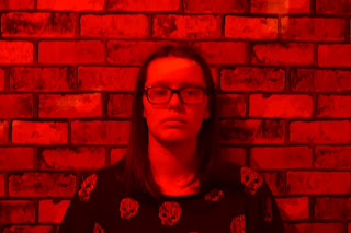
This is another example that I liked, although some of the colours seem to have worked differently than others. The warmer colours like red and purple were difficult to focus on, and although I took them one after the other with no change, it is less focused on the subject in the warmer images, I don't know if I did something wrong with the camera settings. But overall, I think that this image is good because it shows a completely different connotation to the blue tone one, it looks a lot warmer, although still not happy, this is because the red is so intense that it looks quite angry.

Aperture: 5.6
Shutter Speed: 2.5 seconds
ISO: 400
This is a bad photograph from this shoot, the subject isn't in deadpan which is what I wanted for every image so that they worked together, I wanted the colour to give connotation to how the subject felt, not actual facial expression. Furthermore, the image isn't framed like the others, it is a lot more zoomed in, and although I don't dislike it, I don't think that it works with the rest of the photographs. 
If I were to re-do this shoot, I would probably explore different subjects of different ages, because although I wanted to focus on youth, I can still look at other ages alongside and I think that this could work well with other ages.


Shoot Ten - Straight Images