Showing posts with label research. Show all posts

Thursday, 12 January 2017

Personal Project - image bank

This photograph doesn't especially show age and how it affects people, however I really like the deadpan expression in this photo, he looks very serious and we can't tell how he feels, I would like to use this style of portraiture in my photography because I think it looks a lot more serious and you aren't able to read into it as much, it also means that rather than completely focusing on the model, you might focus on the background a bit more, although this only works when I'm doing an on location shoot, rather than a studio shoot which is where a lot of my deadpan shoots have been so far.

I like this photograph because it shows the soldier when he doesn't know the camera is there. This photo was taken in the Vietnam war and it shows us how the soldiers were probably feeling, many soldiers don't feel bravery in a war, they are more likely to feel scared.

This image shows a man on a boat that is smoking, he looks like he's in his early twenties. Smoking used to be legal indoors so this was probably taken when it was still legal, the model looks very uncaring, he doesn't mind the camera being in his face. This photograph was probably showing the carelessness of youth.

This photograph shows innocence and grace, I really like how the photograph is slightly blurred as it makes it seem a lot softer and nicer. The reason for it being soft is the long exposure times, the models tend to slightly move which creates the soft blur, the artist wanted this effect because it seems sweeter and a lot of her photographs are showing youth and innocence.

This image is inspired by a piece of art called the birth of Venus, the way she is stood looks very un-natural and like she was told to stand this way, this image looks a lot more casual than her others, although it was probably more posed.

This is a photograph by Thomas Ruff, it shows a woman in a studio situation, the model is completely deadpan, she isn't showing any expression because Ruff didn't want his portraits to show emotion, I like this technique because it means that the audience can project their own feelings on to the model. 

This image of Michael Jackson looks very feminine, the way he is holding himself looks very gentle, in addition, he is wearing white which makes him look quite feminine as white is a colour that is associated with women, for example, wedding dresses are white. Furthermore, his hair is long which is seen as quite a feminine thing.

This image shows a teenage boy eating an ice lolly, he has a bright red face, so we can assume that it is a hot day. This photograph is composed so that we can see a lot of the background, this may be because the photographer wanted to show how bright it was so we have some understanding of how hot it was, however she also might've just taken the photograph candidly.

I like this image because of the lighting in it, the photographer has used gel lights for this photograph which have made the skin glow different colours like blue and slightly orange. The gradient of the lighting makes it seem warmer at the bottom and cold at the top as they are being shone in different directions. 

This photo is a very simplistic portrait of a teenage boy, it was taken by George Muncey, he used a small depth of field for this photo which means that the person is in focus but not the background, I think that this makes you think about your interpretations of youth as they don't look like a stereotypical teenager, they look a lot kinder.

This image shows a man who seems to be asleep on a rock, I think that the photographer might be trying to make him look dead as he is wearing quite dirty clothing, in addition to this, the rock is being used as a pillow, when this obviously wouldn't be uncomfortable, so could be showing the romanticisation of death.

This image shows two children eating ice cream at the beach. It was taken by Martin Parr, he over saturates his images and slightly over exposes them which creates this effect of very bright colours. His photographs are not often staged, in this photograph he may have told the children where to stand, however they are just acting like they usually would if there was no camera there, they are looking around, not very focused on the photographer.

This is a photograph of a man in an American prison, I think that this photograph shows how people can contrast themselves, he calls himself a preacher as we can see from his top, however he has obviously broken the law as we can see from the fact that he is in prison.

This image has very soft focus, similar to Julia Margaret-Cameron's photography, however it is a photograph of a teenage girl, whilst many of Cameron's images were of younger children. I like this image because it is very candid, we can see a slight bit of movement because the exposure time was probably quite long, which is why the photograph is also very over exposed.

I think that this photograph shows the stereotypes of youth well, the model is leaning against  the fence and he is wearing quite relaxed clothing, if he was wearing a suit in this photograph then we would not be thinking the same things about him, he is also quite aggressive looking because of his hair, he is a skinhead which has a lot of negative stereotypes due to neo-nazis that shaved their heads.
In addition, the pastel colours of the building behind him contrast heavily with the model and what he is wearing. it looks quite youthful and happy, whereas he isn't really showing this.

I like this photograph because of the lighting, it is very exposed, there is a lot of light on her face and she has barely any shadows on her face due to the flash. This could signify how people over-romanticise their teenage years, they only think about the light sides of it without taking into account the bad parts, they look back on it like it was the brightest time in their lives when really it probably had some dark parts as well.
I like the composition of this image, it is very centred, I also like the punctum of this image, it is very bright compared to the rest of the photo. The image is quite muted with whites and greys and light pinks, however in contrast the frame is incredibly bright and it attracts your eyes towards it. 

This photograph has great composition, the entire model is in the photograph and the way they are standing shows off the model planes really well. Furthermore, the clutter on the house makes it look very lived in, rather than a photograph taken in a studio, where we have no idea of the sort of place he lives in.

I like this photograph because of the composition, the model isn't exactly in the centre, he is off to the right a little bit, I think this looks better because of the rule of thirds, our eyes are focused more on the boys face because of its placing in the photograph, it is right about where the two lines meet going different ways on the rule of thirds.

This photograph shows a man with tattoos on his face, he looks quite aggressive, this shows us how the way people present themselves has an affect on our opinion of them. Without the tattoos, he wouldn't look odd at all, it would just be a boring portrait.

This image uses very high key lighting which gets rid of all of the shadows in the image, making the subject look quite 2D. Her hair is the only part of the image that has structure, everything else is quite washed out. I like the washed out effect because it brings all the attention to the glasses in the image, this is emphasised further by the fact that she isn't wearing a top and that the background is white. It makes the photograph seem very washed out.

This is a photograph by Chuck Close and it is of a Christian woman throwing a grenade, this is very unstereotypical because christian women are usually quite passive when they are portrayed in the media. I also like how the lighting is set out, the woman is standing in quite a dark area which could be seen as a portrayal of evil, although she is throwing the grenade into the light which makes it seem like she is giving up her religion in a way.

This image is of a woman who is presumably a swimmer, her portrait was taken outside as we can see from the background, however the photographer used a small depth of field for this image so that all of the focus is on the swimmer, not the background. She isn't wearing much clothing which makes the image quite plain, this attracts all the attention to the swimmers face as it has the most colour and is the most interesting thing of the portrait.

This image is a great portrayal of gel lighting, it shows a large contrast between hot and cold, the parts that are red are very bright, whilst the parts that are blue are quite dark, this could be portraying a change in emotions, for example from sad to angry.

This image is a portrayal of how age changes us, it shows the direct differences between the two as we are able to compare them side by side. This image took a very long time to make as it is made up of two photographs, one of them being when the woman was young, one when the woman was old.

This image is a lot more candid than a lot of the others, the photographer has only focused on the subjects face and the smoke, the rest of the image is quite blurry. Even the face isn't that in focus, which shows that he was probably moving quite a lot

This is a photograph of a skinhead woman, she is looking up at the camera, the natural lighting creates shadows on her face that give a negative connotation as she looks quite angry, there is quite a lot of shadowing on her face, as well as the eyeliner under her eye that makes them look very dark as well. Her hairstyle also gives a negative connotation as skinheads are often associated with neo-nazis, even if they aren't any more.

This photograph of Paul McCartney is by Linda McCartney, it is quite a candid photograph and shows how normal celebrities can be, it is a very interesting portrait because he isn't looking into the lens, although he is probably aware of it being there as it is so close to him. It looks very informal as he isn't dressed up, in addition, the background is very bright, although there is imperfections like the discolouration and the part that is black. 

This image is probably a polaroid photograph, we can tell this because it is so over exposed, the face looks very washed out as it is almost white, hover this could also be makeup because we can see some darker makeup on the bridge of the nose and the eyebrows. I like the contrast of black and white in this image. I also like the shadow that we can see behind the subject of this photograph as it makes the white look even brighter because it is almost against a black background.


Tuesday, 11 October 2016

Research Log

Alec Soth:
This photograph is of a trans woman in Mississippi, the colours in this photograph in contrast to the dull grey background make the model look much brighter and happier. I really love how the hair and the dress go together so well with the bright flowers and the ginger hair. I am inspired by this photograph because I think that it shows how you can still be happy and carefree when you are older and it isn't just for children, usually we see older people as very serious and boring so seeing the other side of this is quite interesting for me and I would like to look at this a bit more.

This is a photograph of an old man in Paris, this photograph looks great because of the colours used in the photograph, the green surrounding him really goes with the yellow behind him and the brown that he is wearing, I believe that these colours all go together really well. I would also like to take photographs of people this age instead of all of my photographs being just people my age. This photograph inspires me because of how it is framed, the subject is situated in the centre of the photo which looks really good in this photo, however usually I think it looks better off centre.

This image is of a young adult, the photograph is coloured really well because of the two different pinks, as well as the ginger hair colour on the girl. I think that the colour looks quite muted because of the light colours against the white background, and I think that this looks really good. This photograph inspires me because it shows the way youth dresses and how they react to having their photograph taken, she looks almost annoyed at it.

This is also a photograph of a young adult, however this photograph is of a boy around my age. In my first shoot I only took photographs of girls so I don't have a large range of people in my photographs so far. I would like to get some more images of boys. I really like this photo because of the contrast in colours, the boy is wearing dark colours, but the background is very light. this works really well because of how clear the background is, without being boring.

Martin Parr:
This photograph by Martin Parr is of a middle aged woman, I think this is a really good photograph because it shows the place that she lives as well as the way she dresses, it gives us more of an insight into her life. The way she is looking into the camera with that pose attracts the viewer into the portrait. 

This image is of a teenager in the 1980s, I really like this photograph because it shows the mood of the girl really well, she is obviously very tired of the job as it's quite tedious. I think that this photograph shows the over-sexualisation of woman, we can see one of the boys staring at the woman.

I really like this photograph, it shows two young girls, I think this is a interesting photograph because of the way it shows the two little girls, usually when we see young children we expect them to be quite happy and cheerful, however these children are pulling quite moody faces. I also like the colours in these photographs, the orange hair goes with the jumpers that the girls are wearing, the bright colours contrast with the dull background in these photographs.

This photo is of a elderly woman on the beach, I think this is a very good photograph, it is contrasting to our normal stereotypes of elderly women, she is dressed like a much younger woman (i.e. in a bikini), this is interesting because it isn't what we normally see so it is definitely fighting against stereotypes

Thomas Ruff
I love this style of photography because it shows the subjects face in a deadpan position. In my opinion this is a really good style because the audience is able to project their own feelings and prejudices onto the image. Another reason I like this image is because of the lighting. It is an example of mid key lighting, which works really well with this style, we aren't distracted by any shadows in the background or on the subjects face. It is lit very well and the face is very detailed. With deadpan portraiture, we are able to imagine who the subject is, what job they have, what they do in their free time etc. 

This is another deadpan image by Thomas Ruff, I think this image is very interesting because of the way it is framed, by only including the head and shoulders, we don't know what the body looks like, the woman may only have one arm, there is no way that we would ever know from looking at this photograph. A photograph like this raises a lot of questions about the subject, although we get to see the face in extreme detail, we don't know anything about what the subject looks like overall, for example we don't know if she is disabled or if she is tall or short.

Thomas Ruff studied under Bernd Becher, I can really see a similarity in the two photographers, Becher took photographs of the same type of buildings to create a collage, and I can see a similarity in his work and Thomas Ruff's work, especially if they are put in a collage set out, like they are in galleries. In his photograph the subjects always look straight into the camera, his portraits suggest that it is impossible to photographically a subjects inner life.


This photograph shows the size of the portraits in a gallery setting. I think that this choice of set out means that the audience is grabbed by the portraits as they are so large and stand out. They are also highly detailed so although they don't have any context for the audience to study, they are still interesting to look at. 

Gavin Watson:
This photograph by Gavin Watson was for a Dr Martens shoot, however I still really like the photograph, the subject is a skinhead, however it is less of a statement/subculture now and more of a style. The location of the portrait is on an flat estate, which is similar to where his older documentary shoots were located. I think that this location shows a very true representation of many Londoners. 

This photograph by Gavin Watson is part of his Skins & Punks, I really like this photograph because it shows the skinhead boy in contrast to the average people on the tube, furthermore, we can tell that this wasn't taken recently because the boy is smoking on a train which hasn't been allowed for over ten years. He is looking into the lens with a very smug expression on his face. I really like the choice of keeping it out of colour, as I think it signifies that he is living in a very boring world and he is quite out of the ordinary.

This is a photograph of two skin head boys in the 1980s, they are standing on a bridge looking at the road below, they are standing in poses that make them look much older than they actually are, they are probably only around 11 but they look like teenagers from the clothes they are wearing and the pose they are standing in. At the time skinheads were quite popular so it probably wasn't uncommon for younger children to dress like that, probably copying their older brothers and sisters, however looking back now it does look quite odd.

I really like this photograph of a punk girl in the 1980s, she is not focused on the camera at all, she is standing with a worried expression. This gives us a bit of insight into how she feels as she isn't completely deadpan, nor is she pulling an expression for the camera. I also think that the lighting looks really good in this photograph, it was taken outside so it isn't synthetic lighting.

Rineke Dijkstra
This is part of Rineke Dijkstra's beach portraits collection. I think that these portraits are really good because of the way the subjects are shown, they are wearing a minimal amount of clothing, the boy in this photograph doesn't seem very bothered about the photograph like some of the other young teens, he looks quite confident, he isn't trying to cover himself or standing really awkwardly. 

This photograph isn't very natural looking, the girl is standing with her arms straight at her side, this isn't a natural position for someone to stand in. I think either she has been told to pose like that, or that she feels awkward from having her photograph taken so she is standing very robotically. She is probably only about 13 years old and many 13 year olds don't feel comfortable about how they look so she may be trying to hide the way she looks from the camera.

This photo is of a young girl in her house presumably. The background is very light and she stands out a lot in the photograph as she is wearing all black. This shows polarisation against the background, she may be wearing all black to show that she is rebelling against the norm. The house has very neutral colours but her wearing all black shows how she doesn't want to fit in.

Rineke Dijkstra takes portraits of people in their raw state, she likes to show how people look naturally, this photograph is of a woman that has recently given birth, she isn't wearing any makeup or any clothes to show her in a better state. These photographs are quite interesting as they show 

Don McCullin
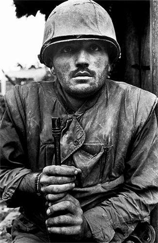
This photograph was taken in Vietnam between 1966 and 1975 when McCullin worked for the Sunday Times during the Vietnam war. In this photograph, the shadow of his hat is covering his eyes due to the way McCullin angled the photograph, he may have done this to show how the soldier doesn't want anyone to be able to see who he is, or for him to be able to completely see what he is doing. Furthermore, he isn't looking into the camera lens, he is looking behind it, he may have seen something behind the camera or he may just not be focused on the photograph taken, we don't know the context so it's possible that this man has PTSD.

This image is of a Cristian woman who is throwing a hand grenade. I think that this photograph shows the usually unseen side to war, the media tends to just show the soldiers fighting rather than the civilians. However McCullin shows the other side to war. This woman is of a religious background so to see her throwing a bomb that could kill someone is incredibly unusual and interesting, it gives us a more 3D view of how people act in these situations. Additionally, the way this photo is framed means that her face is mostly hidden, McCullin may have done this to signify that this isn't her usual behaviour so he didn't want to put a face to the person.
Reference: http://www.hamiltonsgallery.com/artists/29-don-mccullin/series/conflicts/ (Photo 2) Accessed on the 21/11/2016.

This photograph is of a man in Vietnam. In the image, it looks like he is about to be shot, however we don't know if actually did get killed after the image was taken or not, so this image leaves a lot to the imagination. The image was also taken in an area with lots of housing, so it is likely families lived there, it is depressing to think that children have to be around this and the photographer probably wanted us to think about that when we look at it.

This photograph is of a man on a ship smoking, we can tell that this is quite an old photograph because smoking in public places has been illegal for quite a long time. I think that this is a good example of documenting youth, he looks very carefree and the way he is looking at the camera looks like he was expecting the photograph to be taken so it isn't candid like the majority of his photographs.

Annie Leibovitz 
This photograph by Leibovitz shows the model in a very serious position, he looks angry and the lighting is directed in a way to define this. His facial features are casting large shadows which blocks out some of his face, if his face was well lit then he wouldn't look as angry. I think that the photograph was taken like this to match with Iggy Pop's stage personality, many of his other photographs are taken in this style and it matches with how he is seen by his fans.

This image is very simple, it was taken in a studio situation as we can see from the lighting and the background. I think this photograph looks really good because of the contrast between the model and the dark background, the shadows on her face are also really defined.

This photograph of Leonardo DiCaprio is quite odd, it leaves us with a lot of questions, why is he holding a swan? He may be holding the swan because he is a animal activist, he may be holding it to show a different side to him that not everyone knows about.
The background is out of focus, however it looks like the photograph was taken outside of a studio environment. The lighting in this photograph is similar to her photograph of Angelina Jolie, it whitens out the face whilst still keeping definition in some areas like the eyes. 

This photograph of Michael Jackson shows his femininity, he looks very fragile in this photograph because of how he is posed, it looks like he is trying to cover himself up. In addition, his face is very curved which makes him seem quite feminine, Leibovitz could've used harsher lighting like she did on the photograph of Iggy Pop to make Jackson seem more masculine, however she didn't do this in this image.

George Munchey 
The photographer for this image is George Muncey, he primarily uses film cameras although he does use a lot of different formats like DSLR cameras and even his iPhone, I really like his photography because he looks into the youth of London, and captures the beauty of London as well as the people that grew up there. I would like to try and take photographs like these for my shoots, the subjects of these photographs are a similar age to me so I would be able to get photographs of people like this. In this particular photo he has focused on the foreground and kept the background blurry, however the majority of his photographs keep the background in focus, because the place they are is just as important to the photo as the person in it.

This photograph is another of George Muncey's, it shows a boy sitting on the floor of an exhibition, I really like this photograph because it would be a great photo without the art behind him, however this tells us where the photograph was taken so we know more about what is happening, for me the punctum is definitely the art on the wall in this image, I really like that we can see the whole body of the boy, instead of just his head and torso like many of George's other photographs.

This photograph was taken using a flash camera which creates a high key lighting effect like we can recreate in a studio. I really like this photograph because of the contrast in light and dark, the girl has a very bright face but the shadow behind her is also on the side of her face.

This photograph was taken using a film camera, I really like it because of how candid it is, I really like that the model is in the centre of the photograph, it makes the photograph look symmetrical. The no smoking sign on the side of the photograph is the punctum of this image as it drags my attention towards it, I really like how relaxed this photograph is.

Sophie Days
This photograph is of two people, a boy and a girl, the boy is facing away from the camera and he is smoking, the girl is facing towards the camera. I really like how the sunset is contrasting against the subjects of the photograph, they are wearing all black and the way they seem to be acting is very stereotypical of teenagers. The sunset has created a very dreamy colour which creates quite a contrast with the way they are acting. Furthermore, the direction he is holding the cigarette makes it look like the clouds are the smoke.

This photograph shows a boy walking away from the photographer on the phone holding his skateboard. He is smiling at the camera which tells us that he probably knows the photographer, he seems very comfortable around the camera, whereas usually people look a little uncomfortable around the camera. 

We can tell that this photograph was taken in the middle of the summer when it was hot, because the boy is very flushed due to it being really warm, as well as the ice lolly that he's holding. He doesn't look like he cares very much as he is very casual about the photograph being taken, he isn't worried that his hair might look bad or that he looks really red. I think this tells us that he probably knows the photographer. I think that Sophie probably mainly takes photographs of her friends or at least people that she knows, rather than taking photographs of strangers.

This photograph of a boy looks very plain, the colours aren't very interesting and they look quite plain. The boy in the photograph is causing quite a contrast with the deep red that he is wearing, he looks a lot darker than the light coloured background. Days often uses flash in her photographs as we can see here because it looks very light in the centre and quite dark at the bottom. I really like this effect because it keeps you focused on the subjects face. 

Chuck Close 
Chuck Close uses a very small depth of field for his photographs, he focuses on the facial features but anything behind that like the ears is already blurry as the focal length is so small. Close's photographs show an incredible amount of detail on the models face, we can even see the pores on the subjects face. These portraits don't portray the models in an attractive setting, they are quite ugly, however they show the subjects imperfections which many photographers avoid.

This is another example of this type of portraiture, it is called a daguerreotype, which is a type of photography where the photograph is printed onto a silver plate, it creates a very detailed image, however it is quite expensive to do, especially at the time, only wealthy people could afford to have their portrait taken. This image looks like it was taken at quite a candid moment, like she knew the camera was there but she wasn't expecting the photograph to be taken at that point in time.

This photograph is of the artist himself, it is a self portrait, I really like this style because of how much detail the portrait goes into, without actually showing much at all, the image is only focusing on a small part of his face, even some of his beard is out of focus, it is quite interesting how he decided to do that as it brings all focus to the middle of the face where the nose is. The Daguerre style of photography makes the image look slightly warped due to the way it is exposed.